Colors have the magical ability to transform your home into a harmonious haven! From calming blues that sweep away stress, to invigorating yellows that lift your spirits, there’s no denying the power of color psychology in creating a truly blissful living space. In this blog post, we’ll dive deep into the fascinating realm of hues and shades, unraveling their profound impact on our emotions and well-being. So get ready to unlock the secrets behind choosing the perfect palette for your abode, as we delve into “The Power of Color: Using Psychology to Create a Harmonious Home.” Prepare yourself for an insightful journey that will forever change how you perceive color – and ultimately revolutionize your home decor!
The Psychology of Color
When it comes to creating a harmonious home, the power of color should not be underestimated. The colors we surround ourselves with can have a significant impact on our mood and overall well-being.
Through the ages, different cultures have ascribed different meanings to colors. In the Western world, for example, white is often associated with purity and innocence, while black is associated with power and sophistication. In China, meanwhile, white is associated with death and mourning, while red is associated with good luck and happiness.
Of course, individual experiences and preferences also play a role in how we perceive colors. Some people find certain colors calming while others find them energizing. Some people prefer subdued hues while others prefer brighter shades.
The psychology of color is a complex topic, but there are some general principles that can be helpful when choosing colors for your home. Here are a few things to keep in mind:
1. Certain colors can affect our moods.
2. Different cultures ascribe different meanings to colors.
3. Individual preferences play a role in how we perceive colors.
4. There are some general principles that can be helpful when choosing colors for your home
Tips for Selecting Colors for Your Home
There are a few things to keep in mind when selecting colors for your home:
1. Consider the feeling you want to create. Each color has its own unique feeling and energy. For example, red is passionate and exciting, while blue is calming and serene.
2. Think about how the colors will work together. You don’t want your home to feel like a rainbow, so it’s important to choose colors that complement each other.
3. Take into account the natural light in each room. Certain colors can look different in different types of light, so you’ll want to make sure you’re happy with the way they look in your space.
4. Keep your personal style in mind. Ultimately, you want your home to reflect your personality, so make sure the colors you choose are ones that you love!
How Different Colors Affect Moods and Emotions
Color has a huge impact on our moods and emotions. Different colors can affect us in different ways. For example, blue is often associated with feelings of calm and relaxation, while yellow is often associated with happiness and energy.
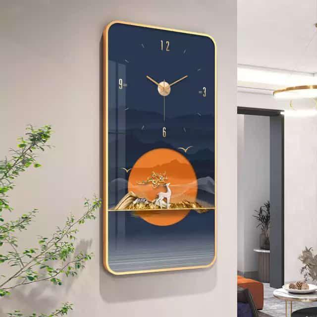
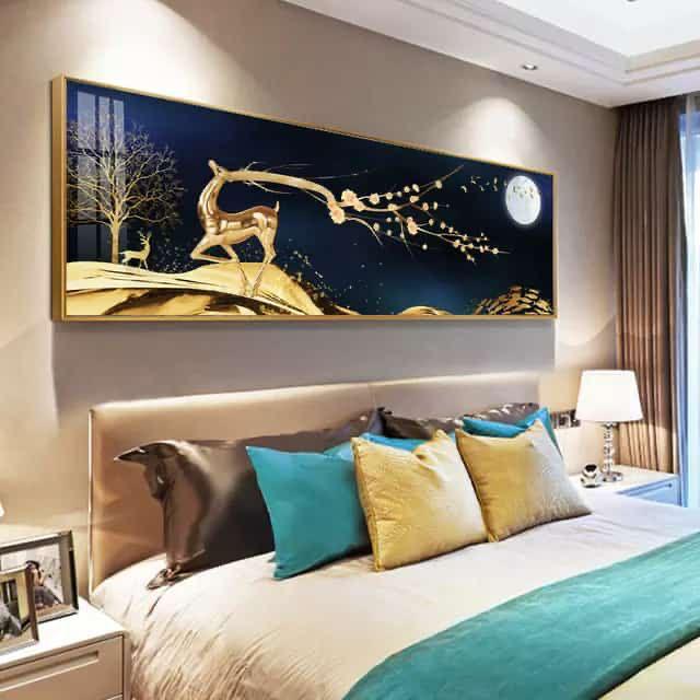
Red is a powerful color that can stimulate the senses and create a feeling of excitement. It is also associated with danger, so it is important to use it sparingly in the home. Orange is another stimulating color that can be used to add vibrancy and energy to a space.
Green is a calming color that is often used in hospitals and doctors’ offices because it has a soothing effect. It can also help to boost creativity and productivity. Purple is another calming color that has associations with royalty and luxury. It can create a feeling of sophistication and elegance.
Combining Colors to Create a Harmonious Space
Different colors can evoke different emotions, so it’s important to choose a color scheme that create a harmonious feeling in your home. Here are some tips for combining colors to create a space that is both stylish and calming:
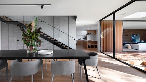
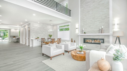
-Start with a neutral base. Neutrals like white, beige, and grey can help to ground a space and provide a blank canvas for adding pops of color.
-Choose one or two main colors. These should be colors that you really love and will want to see throughout the space. Once you have your main colors, you can start to play around with different shades and tones to create interest.
-Add accent colors sparingly. A few well-chosen accent pieces can really bring a space to life, but too many can be overwhelming. Stick to one or two accent colors and use them sparingly for maximum impact.
-Be mindful of color temperature. Warm colors like red and orange can be inviting and energizing, while cool colors like blue and green can be calming and refreshing. Choose a color scheme that fits the mood you want to create in your home.
The Basics of Color Theory
Color theory is a science and art unto itself, which explores how colors interact and how best to use them in design. The basics of color theory are simple: there are three primary colors (red, yellow, blue), three secondary colors (orange, green, purple), and six tertiary colors (red-orange, red-violet, yellow-green, yellow-orange, blue-green, and blue-violet). Colors can be mixed together to create new colors or they can be combined in different ways to create various effects.
The most important thing to remember about color theory is that it is all about creating balance and harmony. When selecting colors for your home, you want to consider the overall mood you are trying to create. For instance, if you want a space to feel calming and relaxing, you would likely stay away from bright and bold colors and instead opt for more muted hues. On the other hand, if you want a room to feel energizing and exciting, then brighter colors may be the way to go.
In addition to thinking about the mood of your space, you also want to take into account the amount of light that the room gets. A sunny room can handle bolder colors than a darker room. And finally, when selecting furniture and décor for your home, be sure to mix and match different shades and tones to create visual interest and depth.
Popular Color Palettes for Home Décor
Color has a profound effect on our moods and emotions. It can dictate the vibe of a room and set the tone for an entire home. That’s why it’s important to be thoughtful when choosing paint colors, fabrics, and finishes.
The right color palette can make a small space feel open and airy, or give a cozy room a warm and inviting feeling. It can also make a statement or simply blend in with the rest of your décor.
There are endless possibilities when it comes to choosing a color scheme for your home. But if you’re feeling overwhelmed, here are some popular palettes to get you started:
Neutral Colors: White, ivory, beige, gray, black
Calming Colors: Blue, green, lavender
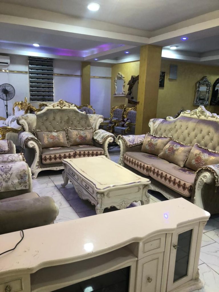
Chic Colors: Pink, burgundy, gold
Vibrant Colors: Orange, yellow, red
Final Thoughts on Using Color Psychology in Home Design
Color is one of the most important aspects of home design. It can set the tone for the entire space and influence our moods and emotions. Therefore, it’s important to carefully consider the colors you use in your home.
When choosing colors for your home, think about the different meanings and associations they have. For example, blue is often associated with calm and relaxation, while red can be associated with energy and excitement. You can also use color to create different effects in a space. For example, using warm colors like red and orange can make a room feel more inviting, while using cool colors like blue and green can make a room feel more calming.
Once you’ve considered the different meanings and associations of colors, you can start to experiment with different color schemes in your home. If you’re not sure where to start, there are many resources available that can help you choose the perfect colors for your space. With a little bit of planning and experimentation, you can use color psychology to create a harmonious home that reflects your unique style.